I’m back and making comics again! I’m almost finished with the final section of chapter 2!
I’m still refining exactly how I approach things. The steps are the same. I’ve been working one page at a time, but the last two parts I work on a group of pages. A page by itself takes 3 to 6 hours, depending on a variety of factors: do I have to redraw something, is there magic, is there something complex (like hands or detailed scenes).
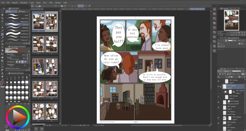
I use Clip Studio Paint EX. I have my comic pulled up to the side and the page I’m working on. I open other pages for reference to keep consistent colors. The main colors I use I have saved in a color palette. I have a Huion Kamvas GT 121 (I think that’s the number?). Screen tablets make linework easier, but any pen tablet will work. I resize things quiet often, so I prefer digital. Occasionally I move panels around.
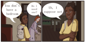
Fortune’s Fancy started as a book with no intention of being a webcomic. So the first step is to translate long paragraphs of text into a script. The book version gives me an idea of how things should look, how characters feel and their reactions, so I don’t keep this in the script. The most important information for me is what the characters are saying. I also include sighs and whispers.


My canvas is 5433 x 7488 at 600 dpi. I set it up through the comic option on Clip studio and I had no idea what I was doing. So that’s the size. It’s 230 x 317 mm, with a binding and boarder size of 210 x 297. I didn’t like how big the boarders were on the default A4 size. I would have to do some fenagling to print Fortune’s Fancy.

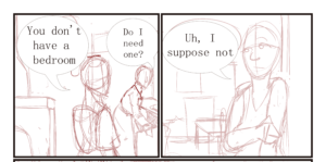
I start zoomed out and draw the rough boxes, characters and text bubbles. I know which circle is Drexel or Mira, so this stage can be pretty messy and incomplete. It can range from a circle with some lines, to actually drawing characters expressions and positions. If the background is part of the character layer (I won’t blur it out), I will draw it. If the background has changed, I will sketch it to give an idea of where they are. I might put in a single word to know which text bubble says what. The script is pulled up next to me, so I have a good idea.
I add the boxes and the text. When I do the lineart, I don’t have to worry about a hand that is going to be covered by a text box. Clip studio has a panel tool, text tool, and bubble tool. Thought bubbles I have to use the extra resources for, so it can be an extra step and an extra layer. On the panel layer, I use the special selection tool to select the space outside of the panels. I fill a layer with white. Anything drawn outside the panel will not show. (I used to do a lot of extra work instead of this step)
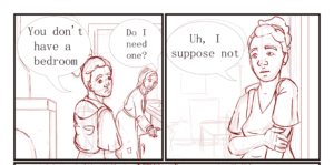
I lower the opacity of layer 1 and sketch the characters. I sketch in red. Clip studio has a feature to turn a layer into a blue draft, which I use. The color of the sketch doesn’t really matter, it’s just one of those “I like it so I do it” things. I added a third layer for the interior that characters interact with (The wall with the fire place, the cabinets, the doorway Mira leans on). I remove the first sketch layer and make some final fixes. This sketch layer goes pretty smoothly, but if I have a difficult section like a hand or a pose, I can be sketchy and use extra lines to figure it out. When I ink later, the extra scribble is not visible. Doing an ink layer here would be difficult to clean up. For all of these layers, I use G-pen at 15 pixels, where the size is related to pen pressure.

I do the linework. Straight lines like the fireplace and doorframe are done with the straight line tool, pressing shift to make it straight up and down, side to side, or 45 degrees. It does not have a line weight variation option that I have found. Most of this is tracing the red layer, but I do occasionally change a few things. The linework, panels, and speech is done in a dark brown, not black.
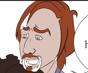
I use the fill bucket tool and lay in the flat colors. This is tricky. I don’t close my lines so if I use the fill bucket straight out of the box, it will fill the whole square. For example, if I use it on Drexel’s goatee, it will fill his whole face orange. I set it to know to stop at gaps. Drexel’s goatee area is still pretty tricky, the end of eyebrows, and Mira’s ears. I go in with the turnip pen, usually set around 30 pixels, and fill in these spaces. I don’t use white for the eyes, it’s a cream color and looks really weird on the white background.
I do the backgrounds. For interiors and exterior city scenes, I use the rectangle tool set to fill. For example, the wall and door behind Drexel, the table and bookcase behind Mira. I use gaussian blur set to 40 to blur out the background. For organic backgrounds, I paint them by hand using the pen tool or brush tool. Since I blur background, I never spend much time on details. Background that characters are interacting with or showing an important location, I will draw as part of the scene. After the backgrounds I reward myself with shading the characters. I shade on the flats layer.
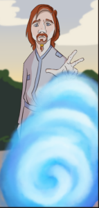
Magic is fun. I will paint with the paint brush the desired effect and then add a layer with a glow or light effect on top. Using a blending brush set with no color, I can add effects like a soft glow. I may also use a blur or motion effect to make the magic look soft rather than using harsh lines. In this example, I have a pen set to low opacity. I swipe it on top of the normal color to get the lighting effect. I then use a pen at full opacity to pick up the new color and use it to add light. Pages with magic have a lot of extra layers. I don’t bother naming layers, which gets messy when there’s a lot of magic on a page.
The file is saved on the comic file. I then save a clip studio file in the chapter folder. I save a .png full size and a .png sized to 800 pixels wide for webtoons and tapas. I use the .png full size to make the clips that I post here and on facebook. My saving process is complicated and convoluted.